
There is a long rumored, and often joked about, common misinformation passed throughout the Black community. This misinformation is that there is a lack of Black men in the Black community, and that Black women outnumber Black men by … fill in the random absurd number you choose. Most often it is said that in the Atlanta area, the number can be as high as 20:1 (men:women). In general the ratio of Black men to women is 1:1, but this often quoted misinformation made me want to know what the numbers truly are. So … being the data nerd that I am, I decided to go straight to the best source I could think of, the U.S. Census data. Once I started diving into the numbers, charting and tracking common qualifiers (e.g., standards, preferences, and “must haves”) that people have, the numbers started to become more alarming.
This post is going to focus on 2 primary areas.
First, a break down of the Black community using U.S. Census Data and information sourced from BlackDemographics.com. Tables within this post are color coded to make the identification of the data source easier for the reader. The blue tables are comprised of data collected from BlackDemographics.com, and the green tables are comprised of data collected from the U.S. Census.
Second, what all this data means, behaviorally, in regards to Black marriage and relationships.
Population (The Black Community)
The Black community is defined by the U.S. Census as those identifying as “Black Alone”, meaning not mixed/interracial/Afro-Latino. While there was data for those identifying interracial, it would have made this already messy data even harder to describe without making you want to stop reading already.
| Age Range | Male | Female | Both | % Male* | % Female* | % Both* |
|---|---|---|---|---|---|---|
| 15-19 | 1,548 | 1,559 | 3,107 | 7.8% | 6.9% | 7.3% |
| 20-24 | 1,561 | 1,644 | 3,204 | 7.8% | 7.3% | 7.5% |
| 25-29 | 1,697 | 1,832 | 3,529 | 8.5% | 8.1% | 8.3% |
| 30-34 | 1,392 | 1,585 | 2,977 | 7.0% | 7.0% | 7.0% |
| 35-44 | 2,460 | 2,951 | 5,411 | 12.3% | 13.1% | 12.7% |
| 45-54 | 2,443 | 2,908 | 5,351 | 12.2% | 12.9% | 12.6% |
| 55-64 | 2,201 | 2,744 | 4,945 | 11.0% | 12.1% | 11.6% |
| Total (15-64) | 13,302 | 15,223 | 28,524 | 66.6% | 67.4% | 67.0% |
| Over 18 | 14,383 | 17,100 | 31,483 | 72.0% | 75.7% | 74.0% |
| Over 21 | 13,384 | 16,198 | 29,582 | 67.0% | 71.7% | 69.5% |
| Under 65 | 17,965 | 19,764 | 37,729 | 90.0% | 87.5% | 88.6% |
Numbers are in Thousands, for Civilians (Non-Institutionalized), including armed forces living off post or with their families on post.
* %’s are based on all ages, ranging “Under 5” to “85+”.
| State/City | Black Population |
|---|---|
| California (CA) | 3,024,208 |
| – Los Angeles | 882,243 |
| – San Fran. – Oakland | 346,781 |
| – San Bern. – Riverside – Ont. | 327,634 |
| Florida (FL) | 3,867,495 |
| – Miami – Fort Lauderdale | 1,169,185 |
| – Orlando | 344,820 |
| – Tampa – St. Petersburg | 329,334 |
| – Jacksonville | 292,881 |
| Georgia (GA) | 3,549,349 |
| – Atlanta | 1,920,782 |
| – Augusta | 209,658 |
| – Columbus | 126,005 |
| – Macon | 103,312 |
| – Savannah | 126,420 |
| Illinois (IL) | 1,999,831 |
| – Chicago | 1,599,415 |
| New York (NY) | 3,763,977 |
| – New York Metro | 3,455,984 |
| – Buffalo | 139,418 |
| – Rochester | 124,259 |
| – Albany | 68,660 |
| – Syracuse | 55,155 |
| Texas (TX) | 3,936,669 |
| – Austin | 153,658 |
| – Dallas | 1,093,212 |
| – Houston | 1,141,697 |
| – San Antonio | 172,410 |
| Other Notable Cities | |
| – Washington, DC | 1,547,874 |
| – Philadelphia, PA | 1,270,826 |
| – Detroit, MI | 960,838 |
| – Baltimore, MD | 812,786 |
| – St. Louis, MO | 513,403 |
| – Memphis, TN | 627,245 |
| – New Orleans, LA | 441,391 |
| – Boston, MA | 384,527 |
| State/City | Black Population |
States’ Diversity
The Black community is very large, but is concentrated in many areas. We typically think of certain states and regions as being “Black”, but the numbers show that regions and states are not as overall diverse as we assume, as they only certain cities represent this diversity.
For example, 80% of Illinois’ Black population resides in Chicago, leaving 20% to be spread throughout a large state. Outside of Atlanta (54% of the GA Black community) and Augusta (6%), the cities Georgia individual carry 4% or less of the state’s Black population.
This is also observed in the State of New York, with the New York Metro Area (the 5 Burroughs) comprising 92% of the state’s Black community. In Texas, 57% of the state’s Black community resides in Dallas and Houston. Texas is the largest continental state, 2nd largest in the Union (1st is Alaska, which is twice the size of TX). Our largest state’s Black population is primarily located in 2 of it’s 4 largest cities.
California
California is a special case, as it is consistently voting to separate and be broken down into 2 states. The separation would leave Southern California (SoCal) as California, and Northern California (Nor-Cal) would become the State of Jefferson. However, the problem arises as neither SoCal nor Nor-Cal want to keep the middle of California. The most recent vote would have been successful, but the vote was to separate into 3 states, with both sides wanting to keep the coastal areas, and rid themselves of the mountain areas.
While’s California’s overall Black community is more evenly spread, it is spread between small pockets. For those familiar with California, especially SoCal, you begin to realize that once again, the entirety of the state’s Black community is centralized within one primary area. As seen in Table 2, 40% of the state’s Black community resides in LA and San Bernardino-Ontario-Riverside. Those of us living in SoCal can attest, they are all within an 1-hour radius of each other, meaning 40% of the state’s Black community is centralized in 1 area of SoCal. The San Francisco-Oakland area is home to 11% of the state’s Black community, meaning 11% reside in one area of Nor-Cal. This means 51% of the state’s entire Black community, a state comprising almost the entire west coast of the country, is centralized into 2 areas, each having a 1-hour travel radius.
Education
One of the first qualifiers people have when finding a romantic partner/mate/significant other is education. Not many people actively pursue someone without at least a high school (HS) diploma, but they may state they desire someone with “at least” a college degree.
| Education Level | Men | Women | Both | % Men | % Women | % All |
|---|---|---|---|---|---|---|
| All Education Levels (Total Respondents) | 12,196 | 14,852 | 27,047 | 100% | 100% | 100% |
| Under 9th Grade (No HS education) | 347 | 439 | 786 | 2.8% | 3.0% | 2.9% |
| 9th – 12th Grade (No HS Diploma) | 1,150 | 1,326 | 2,477 | 9.4% | 8.9% | 9.2% |
| HS Diploma | 4,469 | 4,374 | 8,842 | 36.6% | 29.4% | 32.7% |
| Some College/Associates | 3,406 | 4,717 | 8,123 | 27.9% | 31.8% | 30.0% |
| Bachelors | 1,906 | 2,509 | 4,415 | 15.6% | 16.9% | 16.3% |
| Advanced Degree | 918 | 1,487 | 2,405 | 7.5% | 10.0% | 8.9% |
| HS Graduation (Sum = Total Respondents) | ||||||
| < HS Graduate | 1,497 | 1,765 | 3,262 | 12.3% | 11.9% | 12.1% |
| > HS Graduate | 10,699 | 13,086 | 23,785 | 87.7% | 88.1% | 87.9% |
| College Graduation (Sum = Total Respondents) | ||||||
| < Bachelors | 9.371 | 10,856 | 20,227 | 76.8% | 73.1% | 74.8% |
| > Bachelors | 2,824 | 3,996 | 6,820 | 23.2% | 26.9% | 25.2% |
Numbers are in Thousands, for Civilians (Non-Institutionalized).
After reviewing the data in Table 3, you may have noticed that Black women graduate from HS, college, and post college programs in higher numbers and percentages than Black men. This means that there are more college educated women than men within the Black community.
Behaviorally, most people desire people with similar experiences as them. Meaning, you want someone who can share your experiences, thoughts, and feelings with on a similar level. Most women with a college education don’t want to be with someone without a college education too, especially not someone who has yet to achieve a HS diploma. Likewise for advanced degrees. Most women with a Ph.D. will not probably go seeking a significant other with just a BA.
| Level of Education | Men | Women |
|---|---|---|
| No High School (HS) Diploma | 18% | 15% |
| HS Diploma/GED | 35% | 28% |
| College, no degree | 24% | 26% |
| Associates Degree | 7% | 9% |
| Bachelors Degree | 17% | 22% |
| Special Status | ||
| In Jail/Prison | 6% | N/A |
| Ex-Offender | 34% | N/A |
| Veteran | 14% | N/A |
| Disabled | 16% | N/A |
After reviewing Table 4, will can see that BlackDemographics confirmed the pure US Census data. It also included information regarding another qualifier, one’s “Special Status”. Most people who don not have a prison record (current or past) don’t generally desire someone who does. Also, as a behavioral health consultant, I can reasonably state, most people who are disabled do not have as easy time attempting to date those that are non-disabled. Likewise, I have found that many people who are disabled seek out relationships with others that also have a disability. Again, another example of people seeking out others that share similar experiences.
Work and Finance
Another qualifier is the type of job somebody has. Whether you love being with a person with a Blue Collar or White Collar job, having a preference limits your pool.
| Employment | Men | Women | Both | % Men | % Women | % All |
|---|---|---|---|---|---|---|
| Total Labor Force (“In” and “Not in” equal “Total”) | 14,904 | 17,733 | 32,636 | 100% | 100% | 100% |
| In the Labor Force | 9,518 | 10,750 | 20,268 | 63.9% | 60.6% | 62.1% |
| – Employed | 8,795 | 10,050 | 18,845 | 92.4% | 93.5% | 93.0% |
| – Unemployed | 724 | 700 | 1,423 | 7.6% | 6.5% | 7.0% |
| Not in Labor Force | 5,385 | 6,982 | 12,368 | 36.1% | 39.4% | 37.9% |
Numbers are in Thousands, for Civilians (Non-Institutionalized).
One thing you will notice in Table 5 is those not in the labor force. Let’s be honest, despite your preference for your significant other’s career choices, most people have a qualifier that their mate should at least have a job.
| Occupations | Men | Women | Both | % Men | % Women | % All |
|---|---|---|---|---|---|---|
| All Occupations | 8,795 | 10,050 | 18,845 | 100% | 100% | 100% |
| Management, professional, and related | 2,299 | 3,734 | 6,033 | 26.1% | 37.2% | 32.0% |
| – Management, business, and financial | 939 | 1,206 | 2,145 | 10.7% | 12.0% | 11.4% |
| – Professional and related | 1,359 | 2,529 | 3,888 | 15.5% | 25.2% | 20.6% |
| Service | 1,904 | 2,753 | 4,658 | 21.7% | 27.4% | 24.7% |
| Sales and office | 1,502 | 2,632 | 4,133 | 17.1% | 26.2% | 21.9% |
| – Sales and related | 682 | 981 | 1,663 | 7.8% | 9.8% | 8.8% |
| – Office and administrative | 819 | 1,651 | 2,470 | 9.3% | 16.4% | 13.1% |
| Farming, fishing, and forestry | 13 | 13 | 26 | 0.1% | 0.1% | 0.1% |
| Construction, extraction, and maintenance | 916 | 37 | 953 | 10.4% | 0.4% | 5.1% |
| – Construction and extraction | 509 | 13 | 522 | 5.8% | 0.1% | 2.8% |
| – Installation, maintenance, and repair | 407 | 24 | 431 | 4.6% | 0.2% | 2.3% |
| Production, transportation, and material moving | 2,161 | 880 | 3,042 | 24.6% | 8.8% | 16.1% |
| – Production | 683 | 451 | 1,134 | 7.8% | 4.5% | 6.0% |
| – Transportation and material moving | 1,478 | 429 | 1,907 | 16.8% | 4.3% | 10.1% |
Numbers are in Thousands, for Civilians (Non-Institutionalized).
Something you should notice from Table 6, is that Black men and women have very different career choices. While neither get into farming/fishing/forestry, Black women do not work in construction, production, or transportation very much, and and Black men are less likely to work in sales, office jobs, management, business, finance, or other professional careers than Black women.
Behaviorally, where do most people spend their time and meet the people they have relationships with … either their job or their social circle, which is primarily composed of people they went to school with or work with. Additionally, this job/career data indicates that not only are Black women becoming increasing more educated than Black men, they are obtaining degrees and advanced degrees in fields that differ from Black men. This affects the previously mentioned social circle or school friends, associates, and alumni. This then leads to a scenario in which educated Black men and women are in different social circles and in different fields, decreasing the likelihood of meeting, dating, and marrying.
| Occupation Categories | Men | Women |
|---|---|---|
| Jobs | ||
| White Collar | 41% | 64% |
| Blue Collar | 36% | 8% |
| Service Occupations | 23% | 28% |
| Employment Demographics (ages 16-64) | ||
| Employed | 67% | 71% |
| Unemployed | 11% | 10% |
| Below Poverty | 26% | 29% |
| Earnings | ||
| Full Time employed (Year round) | 37% | 36% |
| Part Time employed | 23% | 25% |
| No Earnings | 40% | 39% |
| Average Earnings | $37,290 | $33,780 |
Table 7 further indicates the divide in jobs/careers that Black men and women obtain, as women are far more likely to have a White Collar job/career than men; vice versa, Black men are more likely to have a Blue Collar job/career than women.
Also important to note, is that while the percentages of Black men and women that are full-time and part-time employed, in addition to the percentages with “No Earnings”, having a full-time job is typically a qualifier for many people seeking a relationship. More importantly, most people don’t overly seek relationships with people with no earnings, that is usually a deal-breaker for many people.


Finance
| Earnings* | Men | Women | Both | % Men | % Women | % All |
|---|---|---|---|---|---|---|
| Total Respondents | 6,984 | 7,259 | 14,242 | 100% | 100% | 100% |
| Under $5,000 | 42 | 32 | 75 | 0.6% | 0.4% | 0.5% |
| $5,000 – $9,999 | 55 | 104 | 159 | 0.8% | 1.4% | 1.1% |
| $10,000 – $14,999 | 129 | 268 | 397 | 1.8% | 3.7% | 2.8% |
| $15,000 – $19,999 | 346 | 428 | 774 | 5.0% | 5.9% | 5.4% |
| $20,000 – $24,999 | 662 | 799 | 1,420 | 8.9% | 11.0% | 10.0% |
| $25,000 – $34,999 | 1,260 | 1,638 | 2,898 | 18.0% | 22.6% | 20.3% |
| $35,000 – $49,999 | 1,581 | 1,727 | 3,308 | 22.6% | 23.8% | 23.2% |
| $50,000 – $74,999 | 1,660 | 1,351 | 3,012 | 23.8% | 18.6% | 21.1% |
| $75,000 – $99,999 | 608 | 451 | 1,059 | 8.7% | 6.2% | 7.4% |
| $100,000 and Over | 681 | 459 | 1,141 | 9.8% | 6.3% | 8.0% |
* Earnings of workers identifying as FULL-Time, Year-Round.
Numbers are in Thousands, for Civilians (Non-Institutionalized).
Here’s an interesting takeaway from Table 8, Black women outnumber Black men in all earnings ranges/brackets from $5,000 per year to $49,999 per year. It’s only after they both enter the range/bracket of $50,000 to $100,000+, that men outnumber women and have increased percentages. This is not where the discussion turns to whether the gender wage gap is real, true, accurate, etc. This is a comment pointing out that for the vast majority of the Black community, women out earn men significantly in both pure numbers and percentages.
Behaviorally, many people do not seek people who are not in their earning bracket, especially when looking for someone they plan to share their life (e.g., bills, finances, vacations, home, etc.) with, and possibly raise children.
| Household Income* | Family** | Non-Family | Total | % Fam | % Non-Fam | % Total |
|---|---|---|---|---|---|---|
| Total Households | 10,024 | 6,973 | 16,997 | 100% | 100% | 100% |
| Under $5,000 | 482 | 594 | 1,076 | 4.8% | 8.5% | 6.3% |
| $5,000 – $9,999 | 375 | 642 | 1,018 | 3.7% | 9.2% | 6.0% |
| $10,000 – $14,999 | 398 | 892 | 1,290 | 4.0% | 12.8% | 7.6% |
| $15,000 – $19,999 | 469 | 638 | 1,108 | 4.7% | 9.2% | 6.5% |
| $20,000 – $24,999 | 573 | 477 | 1,050 | 5.7% | 6.8% | 6.2% |
| $25,000 – $34,999 | 1,060 | 915 | 1,976 | 10.6% | 13.1% | 11.6% |
| $35,000 – $49,999 | 1,415 | 980 | 2,395 | 14.1% | 14.1% | 14.1% |
| $50,000 – $74,999 | 1,755 | 916 | 2,670 | 17.5% | 13.1% | 15.7% |
| $75,000 – $99,999 | 1,227 | 445 | 1,672 | 12.2% | 6.4% | 9.8% |
| $100,000 and Over | 2,270 | 472 | 2,742 | 22.6% | 6.8% | 16.1% |
* Earnings of workers identifying as FULL-Time, Year-Round.
** Households in which at least one member is related to the person who owns or rents the occupied housing unit (householder).
Numbers are in Thousands, for Civilians (Non-Institutionalized).
Relationships and Marriage
As you will see in Table 10 and Table 11, Black men marry more often than Black women. Depending of the source, 32% to 34.9% of Black men are married, while only 26% to 28.3% of Black women are married.
| Marriages | Men | Women | Both | % Men | % Women | % All |
|---|---|---|---|---|---|---|
| Total Respondents | 15,304 | 18,055 | 33,359 | 100% | 100% | 100% |
| Married | 5,341 | 5,113 | 10,453 | 34.9% | 28.3% | 31.3% |
| – Spouse present | 5,071 | 4,767 | 9,838 | 33.1% | 26.4% | 29.5% |
| – Spouse absent (Excludes separated) | 270 | 346 | 615 | 1.8% | 1.9% | 1.8% |
| Widowed | 414 | 1,498 | 1,912 | 2.7% | 8.3% | 5.7% |
| Divorced | 1,392 | 2,150 | 3,543 | 9.1% | 11.9% | 10.6% |
| Separated | 465 | 668 | 1,133 | 3.0% | 3.7% | 3.4% |
| Never Married | 7,692 | 8,625 | 16,317 | 50.3% | 47.8% | 48.9% |
Numbers are in Thousands, for Civilians (Non-Institutionalized), including armed forces living off post or with their families on post..
| Relationships | Men | Women | All | All USA |
|---|---|---|---|---|
| Married | 32% | 26% | 29% | 48% |
| Divorced | 10% | 13% | 12% | 11% |
| Separated | 3% | 4% | 4% | 4% |
| Widowed | 3% | 8% | 6% | 6% |
| Never Married | 52% | 48% | 50% | 34% |

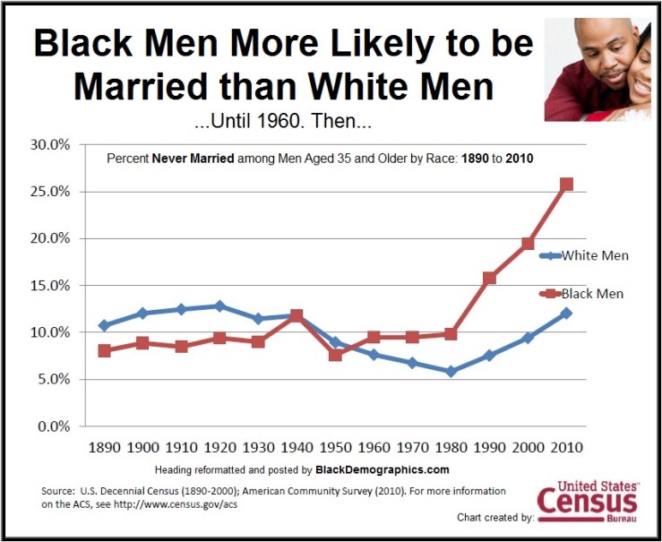
Decrease in marriages
Black marriage as an institution has suffered throughout the years. This is not a knock on the quality, commitment, or strength of Black marriages. It is a comment on the steady and consistent rise in both Black Men and Women carrying the martial status of “Never Married”. Since 1960, “Never Married” Black Men has risen far past those of White Men; likewise for Black Women since 1970. Per Table 10, 50.3% of Black Men and 47.8% of Black Women carry of status of “Never Married”, while Table 11 reports those numbers as 52% of Black Men and 48% of Black Women.
These images were sourced from BlackDemographics.com
Beyond all the qualifiers regarding finding a mate that meets your specific criteria, another hurdle is the self-imposed restrictions. Specifically, issues that arise within the Black community about the willingness to date/marry outside of the Black community. Black women almost exclusively marry men within the Black community, while Black men are more willing/likely to marry women outside of the Black community.

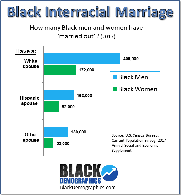
The second image (Black Interracial Marriage) displays the breakdown of interracial marriages between Black men and women.
Behaviorally, Black Women have been trained, whether through social pressures from family or the Black community as a whole, to look down upon the concept of interracial marriage. Meanwhile, it has become more socially acceptable for Black Men to embrace interracial marriages. There is a stereotype that Black Men will begin to date outside of the Black community once they begin to earn more money, which is seen in Black culture in both music (e.g., Gold Digger – Kanye West) and movies (e.g., Diary of a Mad Black Woman). This has created a social divide and tension, where Black women feel they MUST limit their relationship and marriage pool to a smaller community than Black men are allowed to have. As evidenced earlier in the population breakdown, if you live outside of your state’s concentrated Black community, your pool is even further limited.
This limitation of perceived availability of potential mates that meet one’s personal criteria for attraction and relationship standards is only worsened by the alarming actual lack of availability, which can help explain why marriages have decreased within the Black community.
In Summary
Behaviorally, we are training ourselves in the Black community to create a false mindset that our options are limited so we must either expect and accept less, or don’t and continue to devalue the importance of marriage. People accept and conform to their social norms. This Census data objectively shows that the social norms of the Black community have transitioned to acceptance of the following: reduced likelihood of marriage, decreased education levels of Black men, and decrease in employment and earnings.
All of us have qualifiers that make someone either more or less desirable in terms of a potential relationship, partner, or spouse. While in general, Black men and women have a 1:1 ratio, the qualifiers that make Black men more desirable (e.g., education level, earnings, job/career type) don’t affect the availability of Black men in general, but it does increase the available population size of those who meet your specific requirements. This does not include additional qualifiers, such as previous and current marital status, being a home owner vs a renter, having roommates or living with family, etc. Additionally, none of this takes into account the primary and initial qualifier that most people have … is the person physically, mentally, and/or emotionally attractive to me?
Here’s the secret that the Black community doesn’t spread nearly as much … it’s JUST as hard to find a “good and quality” Black woman using all this same criteria. What’s worse, many men have been trained to be averse to women earning more than them or being more educated than them. This means that as Black women become more desirable on paper, Black men value their accomplishments less. The truth is, more Black men need to appreciate the work and effort it took for those women to achieve their accomplishments. And the Black community as a whole needs to stop making Black women feel there should be any negativity in their accomplishments or their dating choices. Why is it okay for Black men to date and marry outside of the Black community, but its not okay for Black women? Why shouldn’t we as a community talk about how hard it should be for Black men to find a Black woman that meets all the qualifications that impose in the reverse scenario.
All these qualifiers do is increase the difficulty of committing to a relationship, which correlates to a decrease in Black marriage. I was always told, it’s called “settling down” because you have to decide what qualifiers you have in your mind that actually matter. What is important to you, and what is something that really doesn’t matter?
| State Data | California | Illinois | New York | Texas |
|---|---|---|---|---|
| Median Household Income | $48,559 | $36,755 | $44,933 | $45,092 |
| Bachelor’s Degree or Higher | 25.6% | 21.1% | 23.9% | 24.2% |
| Married Households | 27.1% | 21.7% | 24.5% | 31.2% |
| Homeowner Rate | 34.0% | 38.0% | 30.4% | 40.2% |
Table 12 is a quick snapshot to help sum up some of what we just discussed. Black men and women are each facing relationship pools that are reduced by many qualifiers. Worsened by the fact that each state that is thought to have high Black populations, really boil down to select cities with large Black communities, surrounded by vast expanses of low population Black communities sprinkled few and far between the next large Black community. Much of this talk about the difficulty finding a significant other within the Black community lies in the fact that everyone’s experience with the Black community varies on the actual size of their individual community.

[…] options in when using qualifiers based on age, education, income, etc., I’d like to reference StevensBx.com. They had an interesting article breaking down the census data of the Black community and how it […]
LikeLike